 |
Summer 2003 |
|
An interview with Denise Giardina ADA: Becoming Accessible From the Director A convergence of printmakers and potters Monoprints of Barbara Marsh Wilson Interview with Mark Wolfe |
Meeting the beholder halfway:
|
 |
Charleston-based graphic designer and illustrator Mark Wolfe is an example of those in the cutting-edge design field who simultaneously devote time and energy to the fine arts. Beginning his career at West Virginia State College’s Graphic Design Resource Center, Wolfe worked successively, from 1987 to 1994, for Perry Productions Advertising and Charles Ryan Associates. He was later art director and illustrator for Willard and Associates. In 1995, he opened Mark Wolfe Design, a studio specializing in design, display, multimedia advertising and publication, with a client list that has included national retailers and Nashville’s Grand Ole Opry. Beginning in 1999, Wolfe established himself as a practicing fine artist with a series of photographic exhibitions at such venues as Huntington’s Renaissance Gallery and Charleston’s Taylor Books Annex. He also participated in shows at Sunrise and the Museum in the Community. |
His show entitled “Graven Images” comprised a selection of pastel drawings and black-and-white photographs, some of which were hand-tinted. All of his photographs, which include landscapes as well as still life and macro studies, were taken in natural light and not digitally retouched or manipulated in any way.
A series of photographic images taken at Spring Hill Cemetery, Wolfe describes them as rooted in a common religiosity, a spiritual iconography expressive of the artist’s own meditations on the progression of life and belief. Wolfe concludes, “A power within yourself figures in all these… how precious life is, how it continues after you’re gone.”
Recently, I had a conversation with Wolfe about his art and his craft, from which the following interview is taken:
Simmons: You practice both photography and design. What do you regard — apart from visual orientation — as the relation between the two (complementary, distinct, etc)?
Wolfe: I do two types of photography, commercial and fine art. The commercial side complements my graphic work. I’m able to not only lay out a publication, print ad or website, but I’m also able to fill these in with my own photography, whether it be a person or just a really interesting background. My camera is a tool during this process. My second form of photography allows me to stretch my creative legs, to allow my camera to become an extension of my interests outside the tightly controlled realm of graphic work. But, my graphic design background helps in composing subjects and understanding the workings and theory behind photography. When I photograph subjects commercially there is a responsibility to the client and what they see or need, but when I am shooting what interests me, I see what I want and photograph subject matter that pleases me — and, hopefully, the viewer.
 |
 |
Two logos by Marke Wolfe
Simmons: In what ways does intended audience play an influence in design?
Wolfe: Good question. I’m always struggling between what I know will be appropriate and what the viewer thinks is appropriate. I try to meet halfway, but at times it’s very hard to make a person understand that, look, this isn’t going to work as you see it. I’m always confused at how people never seem to tell a doctor or plumber, “I don’t think that’s the best route, try it this way.” The work I do is very subjective therefore more vulnerable to open interpretation, and that’s when egos need to be placed aside. The viewer needs to be guided to a visual solution that is aesthetically viable, but also pleasing the audience with the finished product.
Simmons: Walter Benjamin spoke of “art in the age of mechanical reproduction.” Innovation in technology is generally seen as beneficial. Does it also present new problems?
Wolfe: There is no doubt that the advances in technology in its relation to producing art and graphic design have revolutionized the designer and artist in ways unimagined even a few years ago. The only new problems that exist based on this new technology may be cost, accessibility and learning applications that are updated in a matter of months instead of years. But these things are being rapidly overcome now that more people are using computers, digital devices and the like. Prices are coming down, access to Internet stores is nationwide and applications are becoming more user friendly. Much more so than when I started using a computer. I’m old school, I started out on a Varityper, then later graduated to a Macintosh (now called Mac Classic) back in 1984! Computers today are more powerful, faster and very user friendly — and they’re only getting better.
I truly believe that the advent of digital media has expanded creativity to a place where there are virtually no limits to the mind’s eye and its translation on its canvas. I’m very excited to be living in an era where such tools exist. I believe sincerely this is a means to help creative individuals rather than hinder them. Indeed, computers, digital cameras and sophisticated printers are new tools to widen range of possibilities.
There are those that subscribe to the notion that all of this technology somehow taints the art produced by these technological means. Even more, that technology cheapens art! That somehow because physical media weren’t employed, these new tools of technology make the artwork merely an electronic forgery.
There’s an excerpt from Benjamin’s thesis that’s very applicable to these concerns, “The whole sphere of authenticity is outside technical — and, of course, not only technical — reproducibility. Confronted with its manual reproduction, which was usually branded as a forgery, the original preserved all its authority; not so vis a vis technical reproduction.” Benjamin goes on to say, “...technical reproduction can put the copy of theoriginal into situations which would be out of reach for the original itself. Above all, it enables the original to meet the beholder halfway....”
I think that the true authenticity of any work is the essence of person who is creating that work, no matter what medium they choose.
Simmons: Does modern design dissolve or reinforce the distinction between commercial and artistic practice?
Wolfe: These days it seems that design no longer serves the product; the product serves the design. The product prevents true expression and disables the designer from expressing their true vision. Thus design becomes a commodified version of fine art (the kind of art that pays).
The worlds of commercial art and fine art seem to be blending effortlessly together thereby confusing the viewer as to the purpose of either.
The good news is, artists are continually striving to enrich the visual vocabulary of the world community. The bad news is, sometimes we as artists and designers are decorating instead of communicating.
Simmons: What are the artistic considerations behind your photographs of Spring Hill?
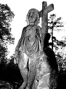
 One of Wolfe’s Spring Hill Cemetery angels. |
Wolfe: A friend mentioned the wealth of history at Spring Hill Cemetery, and I — always interested in making rubbings of headstones — went to see for myself. I fell in love with the place. Not to be macabre, but I do go up there to relax sometimes. You’re just surrounded by all this history. Some of the founding fathers of this town are buried up there. Charleston is a place that likes to bury its history instead of preserve it, but fortunately Spring Hill remains untouched. Photography provides opportunities to frame and give life to subjects that otherwise would be ignored in everyday existence. At times I perceive how an image can be enhanced by presenting another insight into the subject. These pieces are all related in that they reflect the paradox of our human need to believe in something symbolizing life, while we yet remain obsessed with death. |
I saw such celebration of humanity in the monuments, especially in the angels. I’ve published a calendar recently of all of my new angel photographs from there and other states and people have just warmed to them in an amazing way. I’m glad my work can touch people in such positive ways. I don’t want people to be haunted by this stuff. I want them to be encouraged.
Simmons: What trends in design do you see as currently significant or just emerging?
Wolfe: Lately there’s been a disturbing trend in graphic design where every element is merged into a meandering montage using Photoshop filters and throwing in a heavy dose of drop shadows under every word, every image that just leaves me cold. It’s a West Coast offshoot that peaked in during late 90s but has unfortunately taken hold here in Charleston. It’s just disturbing because those elements can enhance a layout, but used constantly on everything, is just too much. I subscribe to a more traditional form of layout which is East Coast based. In other states, especially New York, this way of designing is strong. It’s the “less is more” school of thought in regards to design and layout. More room around images and type, streamlined and clean, leaving the message undisturbed and clear.
There’s also a big swing towards a retro look. An 80s color scheme with vibrant reds, blues and oranges using a minimal look very akin to Milton Glaser (New York illustrator and graphic designer who created I Love New York stickers) approach that combined color, original art back into a graphic arts. I’m looking forward to that making it through town eventually.
Let me leave you with one other quote. This captures my thinking on the new technological innovations we now have at hand. This is from Pieces Sur L’art: Le Conquete de l’ubiquite, by Paul Valery: “Our fine arts were developed...in times very different from the present, by men whose power of action upon things was insignificant in comparison with ours. But the amazing growth of our techniques, the adaptability and precision they have attained, the ideas and habits they are creating, make it a certainty that profound changes are impending in the ancient craft of the Beautiful. In all the arts there is a physical component which can no longer be considered or treated as it used to be, which cannot remain unaffected by our modern knowledge and power.… We must expect great innovations to transform the entire technique of the arts, thereby affecting artistic invention itself and perhaps even bringing about an amazing change in our very notion of art.”
 |
 |
The cover and an inside page from a publication aimed at convincing young people to consider higher education.